
Atomic Extinguisher Service
Atomic Extinguisher Service, LLC is a fire extinguisher sales and servicing company.
-
February 2025
-
An Extinguisher Sales and Servicing Company
-
Business Owners
-
Problem
The Atomic Extinguisher Service, LLC website was last updated in 2019. In conversation with Atomic, I learned that they were not fully happy with their website.
They felt the website’s overall design did not portray what the company does/create a brand identity, and wanted further consultation on the layout and design.
Goal
Make it clear that the company is centered around fire extinguishers. My goal was for the client to associate the Atomic name with fire extinguishers without having to read any text.
-
My role
Lead user experience designer
Client request
A website consultation and design proposal
My responsibilities
End-to-End Design Process:
User research
Competitive analysis
Wireframing
High Fidelity Designs
Prototyping
Usability testing
Review and analysis of data
Design Process
Understanding the user
-
Knowledge gaps
Not knowing what extinguishers or services are needed for one's business
Quality and trust
Stress about inadequate maintenance and fake extinguishers
Safety confidence
Users do not feel fully confident in using extinguishers
-
Shepard, 50
Shepard is a small business owner
Goals
Keep his business safe
Stay up to date on service checks
User Pain Points:
Knowledge gaps
Quality and trust
Safety confidence
“I just opened my small business and could use someone to help me figure out what type of fire protection is best for my needs.”
-
Arrival > Awareness
Require extinguisher services. Learn about the company through an external source: referrals, social media, or internet searches
Exploration > Education
Explore the website and try to understand the company, the services they offer, and if they are the correct fit for your needs.
Decision > Engagement
The user is ready to move forward and refers to key pages like contact us move forward.
Action > Onboarding
The user calls, emails to begin the process.
Post-Service > Retention/Referral
The user's transaction is complete, and they may become a regular customer or be willing to submit a testimonial, refer you to others, or become a customer once more in the future.
Starting the design
-
I used paper wireframes to rapidly test layout ideas, focusing on information hierarchy and navigation flow without the distraction of visual design.
I used this time to ideate on ways to reconfigure the information to be less overwhelming to take in, since the site has a lot of detail.
-
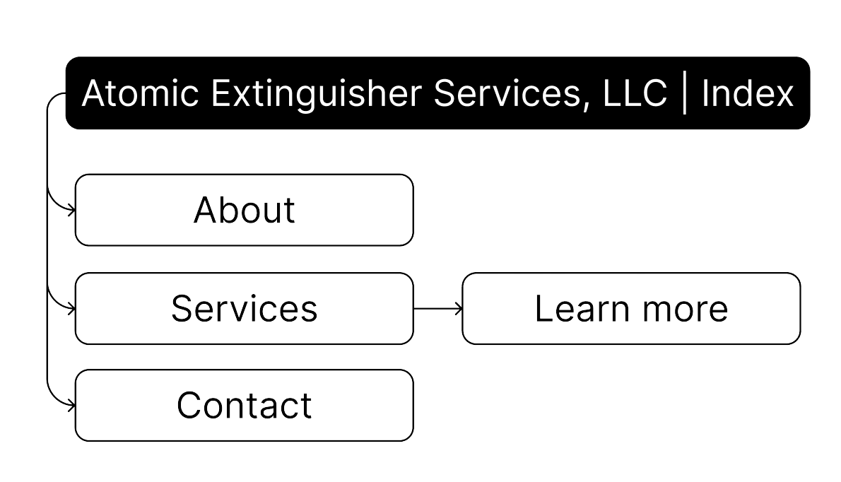
Utilize the global navigation bar at the top of the page to navigate through the website.
Refining the design
-
Utilize the global navigation bar at the top of the page to navigate through the website.
-
Unmoderated, remote, 3 participants, 10-15 minutes
Color Contrast
Some of the design elements and text did not contrast with the background enough to be seen clearly or be accessible.
Old Atomic Logo
The old-school Atomic Logo was updated to a newer, cleaner version, which also inspired the overall aesthetic design evolution.
-
Text
Readable font all above 16px
Text contrast meets WCAG standards
Color
Color contrast meets WCAG 2.0 guidelines
Icons are used along with text and color to convey meaning
Scalability
Users can resize the design without breaking the format
Previous design analysis
-
The overall design does not create much brand identity, so my focus is enhancing this by adding elements related to the work they do, and cleaning up the existing content.
-
Philly Background (main servicing area)
The information included is clear
Design is responsive
-
Hero Image (unrelated to company)
All information on one page (needs to be sectioned and organized)
Some typos