
RockStar Closers
RockStar Closers is a family of title insurance providers servicing Pennsylvania, New Jersey, Delaware, and Florida.
-
July 29, 2025 - Current
-
Title insurance service company
-
Homebuyers, sellers, and lenders
-
Problem
The client already has a website but wants it to have a more professional feel.
Goal
My goal is to take the existing information and logo design and reformat the website into a design that is clean, professional, and easier to take in than the current design.
-
My Role
User Experience Designer
Clients Request
A complete website redesign using the existing information and logo.
My Responsibilities
End-to-End Design Process:
User research & competitive analysis
Wireframing
High Fidelity Designs & Prototyping
Usability testing
Review & analysis of data
Refining & updating the design
Design installation
Design Process
Understanding the user
-
Complexity of the process
Many new homebuyers do not understand title insurance or why they need it. Many can also be confused by the closing process.
Inaccessible support
Issues getting timely responses from those providing services.
Lack of communication
Feeling left out of the loop throughout the process.
Technology gaps
Lack of online portals, e-signing, or status tracking.
-
Mario, 58
Mario is selling his family home
Goals
Close fast and cleanly
Avoid surprises that could kill the deal
User Pain Points:
Previous issues with surprise liens or title defects
Frustrated by poor communication in past transactions
Wants clarity around final net proceeds
“Don’t make me chase people for answers — keep me in the loop and be honest about the situation.”
-
Arrival > Awareness
Learn about the company through an external source: referrals, social media, or internet searches
Exploration > Education
Explore the website and try to understand the company, the services they offer, and if they are the correct fit for your needs.
Explore the company's background, what they do, and a bit about their team. You can also view their blog to read more about title insurance.
Decision > Engagement
The user is ready to move forward and refers to key pages like contact us or get a quote to move forward.
Action > Onboarding
The user calls, emails, requests a quote, or submits a form to begin the process.
Post-Close > Retention/Referral
The user's transaction is complete, and they may be willing to submit a testimonial, refer you to others, or become a customer once more in the future.
They may also be interested in purchasing gear from the company's online store or using the company's other services, like the RockStar Vault meeting space.
Starting the design
-
I used paper wireframes to rapidly test layout ideas, focusing on information hierarchy and navigation flow without the distraction of visual design.
I used this time to ideate on ways to reconfigure the information to be less overwhelming to take in, since the site has a lot of detail.
-
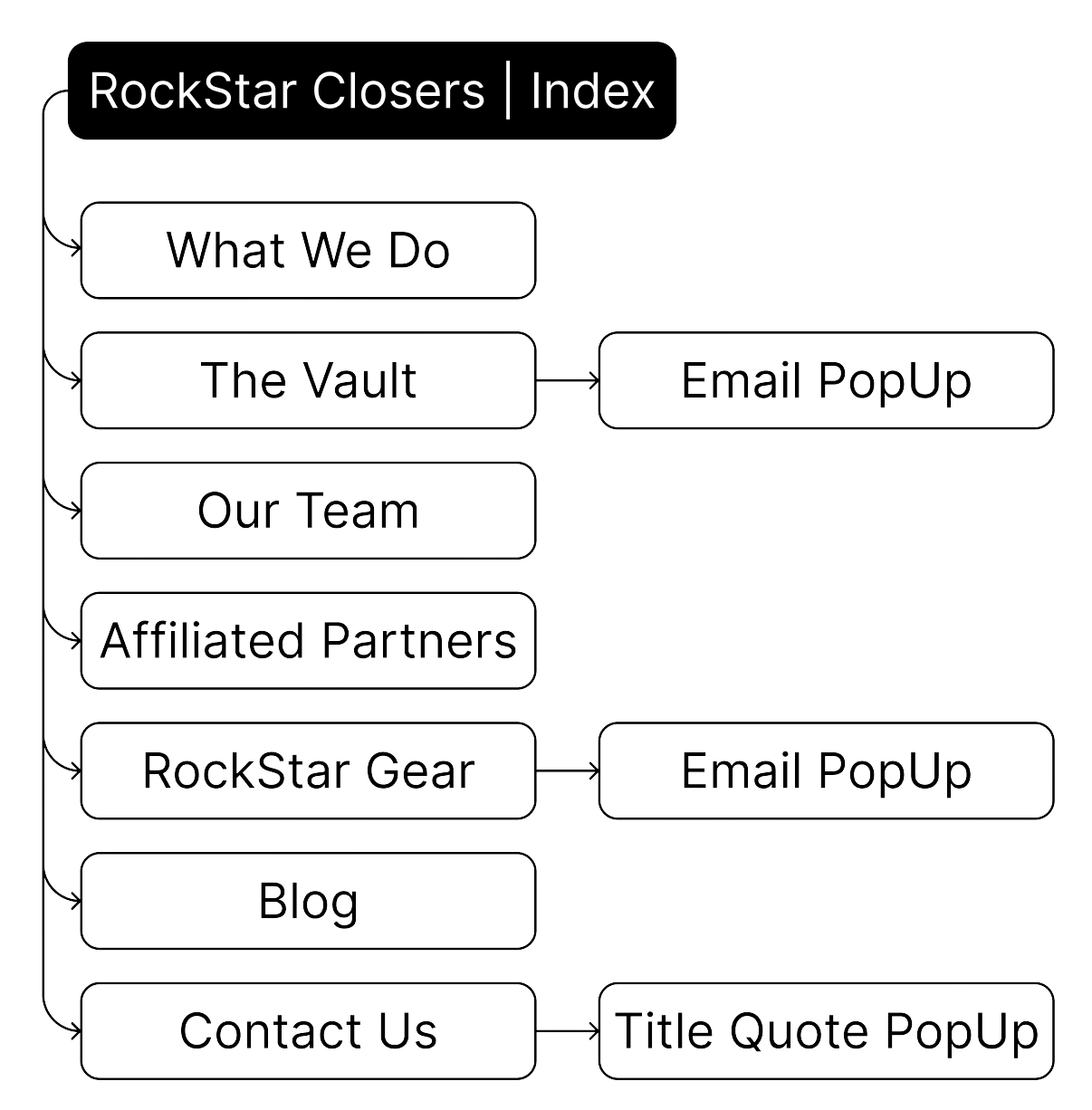
Utilize the global navigation bar at the top of the page to navigate through the website.
Refining the design
-
Utilize the global navigation bar at the top of the page to navigate through the website.
-
Unmoderated, remote, 3 participants, 10-15 minutes
The design could use a small splash of color more
The design gets buggy on the affiliated partners page
-
Text
Readable font all above 16px
Text contrast meets WCAG standards
Color
Color contrast meets WCAG 2.0 guidelines
Icons are used along with text and color to convey meaning
Scalability
Users can resize the design without breaking the format
Previous design analysis
-
The logo is well established with the business, so we want to keep the original design and incorporate the butterfly motif where we can to increase brand identity
-
Website information is very thorough and informative
Large social media presence promoted through the website
Client testimonials are great
Team member photos are very professional
-
The logo above the navigation bar is too large
Consistent use of the caps lock makes the information difficult to read
The design is not completely responsive, and information gets cut off on certain screen sizes
Too many photos/gifs; the website offers a lot of good information, and the moving images and different patterns across pages are a bit overwhelming and distracting to the user
The pop-ups on the bottom corners of the screen are not both collapsible and get in the way of the information on the website
More contact information is included on the Google page for RockStar Closers than is included on the actual website; the website should reflect all of this as well (phone, email, and hours)
Excess empty space at the bottom of some pages that does not serve a purpose
Pricing on storefront items is not included, same with information on how to purchase
Title Quote page can be optimized, with very little information for such a large space
On our team page, team members without photos have storefront items in place of their photos. At first glance, this is confusing because you associate these images with the storefront and not a team member